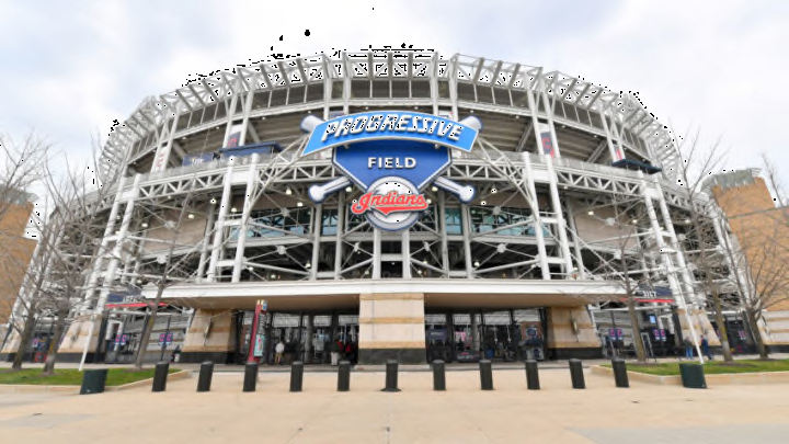
Why did the Cleveland Indians change their name to the Cleveland Guardians?
Well, it’s official. The Cleveland Indians will be known as the Cleveland Guardians beginning in the 2022 season. While any breaking news out of the Cleveland camp this time of year was anticipated to be related to the trade deadline, the club instead found a way to capture more headlines than any trade could muster. Introducing the Cleveland Guardians.
Together, we are all... pic.twitter.com/R5FnT4kv1I
— Cleveland Guardians (@CleGuardians) July 23, 2021
Let’s face it, anytime you can get Tom Hanks to voiceover anything it’s probably going to be a solid video. The emphasis on the city, though, is what captures the fan base. Whether the Cleveland Indians or the Cleveland Guardians, the history will still remain with the organization. This is just the next step forward.
Being featured just outside the ballpark, it was an easy tie-in to Progressive Field to be called the Guardians. Known as the “Guardians of Traffic” the statues stood long before the stadium was built at the corner of Carnegie and Ontario and have been a symbol of progress. An appropriate draw for an organization that is beginning the next step in a storied history.
The other names that garnered the most attention didn’t have as strong of a connection to the city of Cleveland. Spiders is used in multiple landscapes and while branding options were plentiful it wasn’t something specific to Cleveland. It wasn’t even related to this edition of Cleveland baseball, but a team that left the city, or was rather discontinued.
"To protect, to keep watch, to defend. For Clevelanders, this is a way of life. We fight together for what we believe in. And if we get knocked down, we pick each other right back up and keep fighting. We’re resilient, hard working and loyal – to this city and to each other. That’s what it means to be Cleveland Guardians."
The above quote is taken from the page on the Tribe’s website that illustrates and introduces the new name and logos. There might not be a better way to articulate why this name was the one selected from the over 1,000 options that were considered. While the Guardians on the Hope Memorial Bridge were the inspiration, the real selling point was the people of Cleveland.
If there’s one thing almost all Clevelanders do well it’s defend, or guard, their sports teams. It doesn’t matter if it’s the Cleveland Indians, Cleveland Browns, Cleveland Cavaliers or now the Cleveland Guardians, the people of Cleveland are the first to guard the teams that represent them.
A fresh look from the 216. pic.twitter.com/0W8VTtZ7b0
— Cleveland Guardians (@CleGuardians) July 23, 2021
As for the logos, it’s something different. The main positive is that the color scheme will remain and from the looks of the sample fonts, the uniforms might not be altered either. That’s something that might change eventually, but the way the fonts were presented lends the hand that perhaps the look of Cleveland baseball on the field will remain as well.
The fonts are something new and unique to the club, something that is becoming increasingly more common in sports. Matching the numbers to the font is an intriguing new addition and something that could spice up the uniforms just a bit.
As a uniform junkie, the fonts tying into the new “C” logo is a big plus. There’s a clear brand being established and they are following it as closely as they can. It also creates a recognizable look across not only baseball, but all of sports.
More from Away Back Gone
- Cleveland Guardians tantalizingly close to locking up AL Central tiebreakers
- Cleveland Guardians: Terry Francona becomes meme in profanity-laced ejection
- Say goodbye to defensive shifts and hello to bigger bases, pitch clock in 2023
- Cleveland Guardians: Shane Bieber second-fastest to 800 strikeouts in major-league history
- The next week will make or break the Cleveland Guardians’ season
For traditionalists, the font and new “C” logo, being called the “Diamond C” should help pay respect to the organization’s past. The way the C bends in makes it seem like a combination of the current Block C and the past Crooked C while also feeling like something very new. It feels modern, but also timeless. The way all logos should be.
The one that seems off is what is being referred to as the “Guardians Fastball Logo.” I get it, secondary logos allow for creative designs, more merchandise and in the end translates into more money, but this just doesn’t really fit. Maybe it’s just me, but a baseball logo with such a prominent baseball seems cheesy and like it belongs on a little league uniform.
As for the wordmarks, they stay true to what the organization currently has with the addition of the new font. The “Cleveland” wordmark is practically the same, just in the new font. Meanwhile, the Guardians embodies the new font while also taking hints from the current script “Indians” that is used on the home white jerseys and red alternates.
All-in-all, this was a decision that was anticipated. The Cleveland Indians played their cards close to the chest, but it seemed like the Cleveland Spiders and Cleveland Guardians would make it a two horse race. In the end, we now move forward with the Cleveland Guardians. It will take some adjusting, but in time this will be the new norm while alleviating the organization of pressure that has been present for well over 25 years.
