Cleveland Guardians: 2 exciting things, 1 disappointing about the new name
The Cleveland Indians have officially announced that the organization will be renamed the Cleveland Guardians following the 2021 season. While the name change had been long anticipated and announced that it was coming, the official new moniker was a new discovery to fans on Friday (July 23), although the chosen name was highly speculated as the next era in Cleveland baseball before the official announcement.
Even with the anticipation and guessing, the announcement came with plenty of opinions and reactions from fans, media, players, etc. Just about everyone that came across it had some sort of thought on it. For better or worse, this is the future of baseball in Cleveland, the Cleveland Guardians, and in time it will just become the new normal for the club.
With that being said, there was some things that were very well done in the announcement and there was of course some aspects that could have been done a bit differently. For the purposes of this article, we won’t dive too deep into the press conference or anything like that. We’ll just stick to the surface with two things the newly named Cleveland Guardians did well and one that was just a bit disappointing, or maybe a better way to say it is underwhelming.

Positive #1: Cleveland Guardians retains color scheme
One thing that seemed to be a common ground for majority of the fan base was the hope to retain the same color scheme. Changing the team name was painful enough for the fan base, so at least keeping the colors that have been with the club for a long time was a plus.
The color scheme was really just the beginning. Along with that the team will also carry over the two wordmarks of the organization, with some slight adjustments. Cleveland remains essentially the same with the red lettering and blue outline, but the font will change to better reflect the new moniker.
Similarly, the Guardians will be in script as the Indians have been, using red lettering and a blue outline. It can be assumed that the uniforms will also be rather unaltered with the fonts really being the only difference.

Positive #2: Cleveland Guardians will keep Slider as the mascot
Another part of the Cleveland Indians that will stick with the Cleveland Guardians is the team’s beloved mascot Slider. Introduced in 1990, Slider was Cleveland’s attempt to recreate their own version of the Phillie Phanatic. While the mascot might not have the popularity of the Phanatic, Slider has been the first Tribe mascot to truly click.
From an injury during the 1995 playoffs to being elected to the Mascot Hall of Fame in 2008, Slider has basically lived the life of a player. Slider has even had a fair share of bobbleheads. When you really think about it, how could the team not include Slider in the transition? We just said it, Slider is a Hall of Famer, that alone is enough to stay on board.

Negative #1: The Cleveland Guardians “Guardians Fastball” Logo
When the Cleveland Indians unveiled everything for the transition to the Cleveland Guardians that included the new logos for the team. The organization has been using one logo, the Block C, for the last few seasons and sticking with just one logo would have been alright. However, the team showcased two logos. One was an updated C, the other was underwhelming.
The updated C, or Diamond C, was a refreshing take on the logo. It was a bit more creative than the Block C, but not as great as the Crooked C. If that was the only logo, that would be just fine.
However, the team went ahead and added another logo to the mix. The Guardians Fastball logo isn’t exactly what you see around Major League Baseball and the story behind it is a bit different as well.
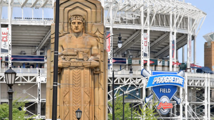
The organization describes the logo as being “inspired by both the helmets and wings of Hope Memorial Bridge’s Guardians statues that keep watch over the city.” That’s apparent and well represented. The only downside is it just doesn’t look like the logo of a professional sports team. A little league team, maybe?
Perhaps it will look better on a jersey or any merchandise, that’s very possible. The bright side is that if this logo ends up being the worst part of the transition from the Cleveland Indians to the Cleveland Guardians, that’s a bargain I’m willing to take.
